Having developed the background further and causing it to become black, you get a feel for the images as a whole and how they would work/come across. I think that they are effective, but something still isn't quite there with them. I think that it's the 'negative' invert of the image, and although they do work well outlined white, i think i'll have to change the line texture. As well as this, i must change the Little White Lies mast head back to it's original white.
Here the text works as a negative, but i wonder what it would be like if it was filled in white...
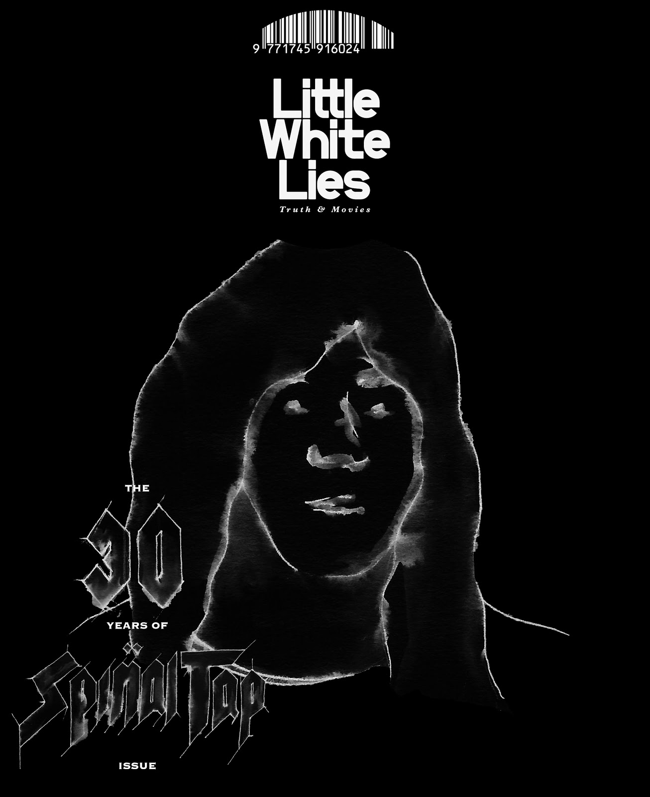


Below is the text filled in white, which, in my opinion, works just as well, if not better. I will still need to refine the lines though and neaten it up.


These poses, especially Derek's (middle with mustache), remind me of the film, and how they come across as a 'want to be' band, and band that has made it, but garishly shows fashions flaws when it comes to doing what they think will get the best 'genuine' reaction, where as actually we're laughing at them, not with them.
These poses and the over all style also reminded me of the Grateful Dead album cover 'In The Dark'. Again, this whole thought process, for example, would occur to Spinal Tap of being fashionable because some one else has done it, but actually they're making fools of themselves.

No comments:
Post a Comment