Wednesday, 23 January 2013

Further Ideas Development


Starting again with the lines Live Traced through Adobe Illustrator so as to be neater when compiled in Adobe Photoshop. Here are the outcomes:


I think that these outcomes above have potential and will be easier to manipulate in terms of inverting the colours, and because of the stronger lines, the images as a whole should appear more powerful.


The mast head is back to white again now and looks good here with this image, although overall it does come across a it pale and lost...


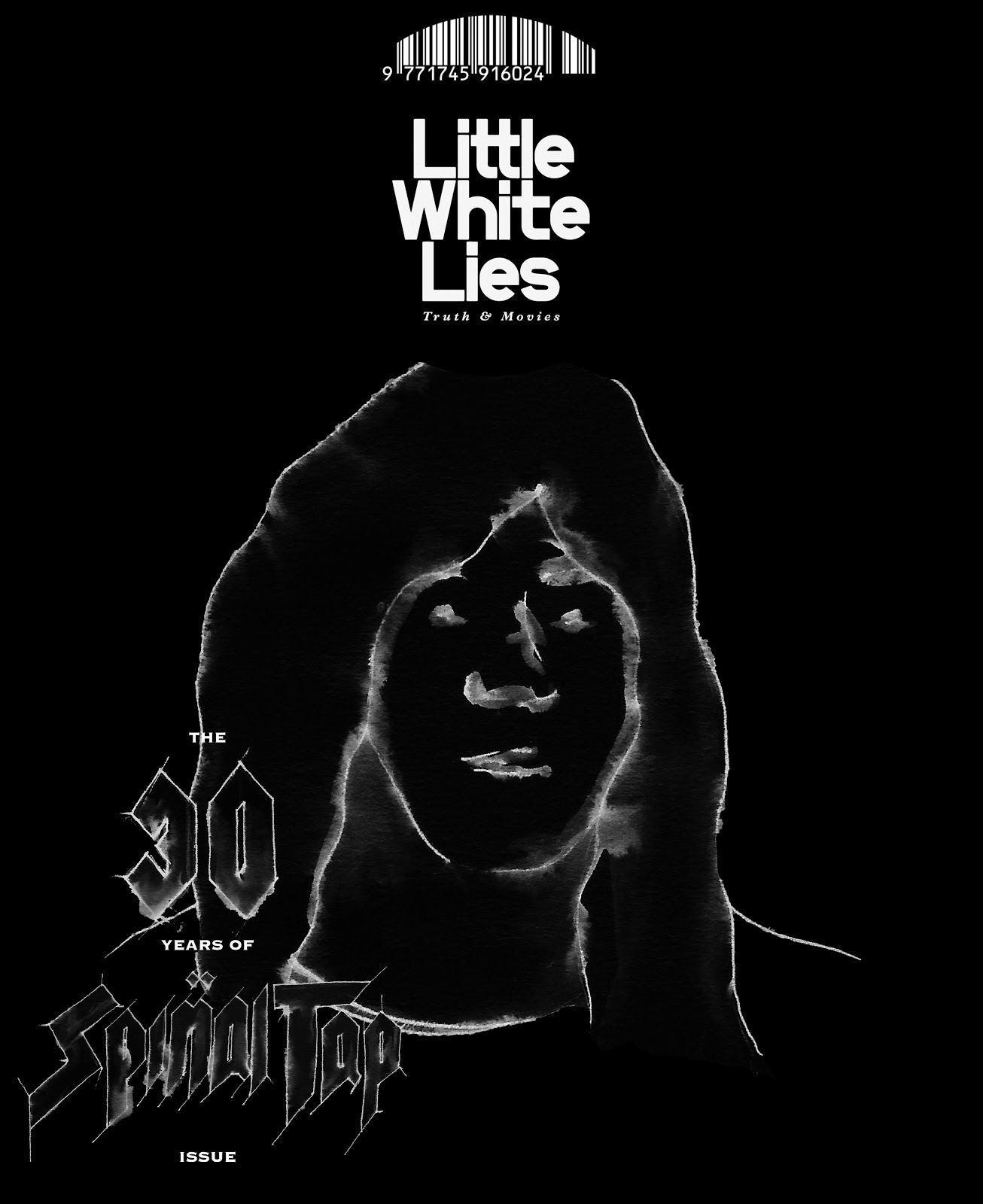
Below is the Live Traced text outcome. It does look messy here, but i also like how rough and ready it appears. Rock 'n' Roll.


The first mock up of a potential outcome. But this time, to fill the space i have enlarged the head. The lines are bold and powerful, which is good, although the text is a bit lost to me down there with all the white...


Silhouette With Text Development


Having developed the background further and causing it to become black, you get a feel for the images as a whole and how they would work/come across. I think that they are effective, but something still isn't quite there with them. I think that it's the 'negative' invert of the image, and although they do work well outlined white, i think i'll have to change the line texture. As well as this, i must change the Little White Lies mast head back to it's original white.

Here the text works as a negative, but i wonder what it would be like if it was filled in white...


Below is the text filled in white, which, in my opinion, works just as well, if not better. I will still need to refine the lines though and neaten it up.


These poses, especially Derek's (middle with mustache), remind me of the film, and how they come across as a 'want to be' band, and band that has made it, but garishly shows fashions flaws when it comes to doing what they think will get the best 'genuine' reaction, where as actually we're laughing at them, not with them.
These poses and the over all style also reminded me of the Grateful Dead album cover 'In The Dark'. Again, this whole thought process, for example, would occur to Spinal Tap of being fashionable because some one else has done it, but actually they're making fools of themselves.


Introducing Text


With not a lot of recognisable outcomes in terms of recognising who each member of the band is alone, straight away, i think that it'll be important to include the title of the film and mimic what Little White Lies does and put 'The... Issue', and seeing as this is the 30th anniversary edition, it will read 'The 30 Years Of Spinal Tap Issue'.

Below i have drawn out the Spinal Tap title in it's original style but kept the theme of the water and ink bleed to show continuity.
Here's the title in context for each cover (I naturally chose the bottom left hand corner for the text because otherwise it would take up too much of the image space and detract the eye):


I think that it works well from a distance, but i know that up close it becomes a very messy version, and although this works  because it relates t the theme of Spinal Tap and nothing quite coming out right, it doesn't come across professional and will need rendering/ revising/development.


Initial Idea Developed - silhouette


Moving forward from my initial outcome to work with, i wanted to keep with the clear theme of black. The Spinal Tap insert and case for the film is black, and the featured album in the film is black.
So, i have inverted all of the white space within the image to black along with the Little White Lies logo to be in-keeping and create a silhouette effect.


The feedback for this was constructively bad, and the reasons for being so were; that the Little White Lies mast head probably shouldn't be black - it should remain white; And that the images come across as poor quality negatives in my own eyes.

However, the use of black within the image has worked well, so i may take it further and produce, perhaps the background in black.

Tuesday, 22 January 2013

One Band Member At A Time


Having come to my senses and realised that having all three band members on each cover edition is not what the brief is asking at all, i have resorted to sticking with showing each band member alone. The idea that has benefited me in the previous project, i have outlined the characters in liner pen and bled the lines with water giving a simple, yet effective texture and look. 


To break away from the previous project and try something new, here i have outlined in thick  marker pen, and then painted in the correct colours loosely using water colour paint.


These work, and have a quality about them, but i don't think that this style is right for this particular project/audience. 


Saturday, 19 January 2013

Thoughts So Far


My thoughts so far are made up of the idea which features all three members on each of the three covers showing the band through the ages. For example i would have an early shot of the band, a 'We've made it' shot, and finally a modern day shot.

The other option that's in my thoughts is the idea of one band member on each cover...

Here are my sketches to show what i am thinking:


Here is an example of what i would like the cover to look like if it were to be a member on each one:


The lowest sketch on the above page is an example of the band in the early stage of their career. This would be ideal for the three on three option.


Again, the band in a 'We've made it' pose.


And finally, my favorite of all so far, the band as they are now.

So it appears that i have my rough imagery for the three members on all three covers option...

Guinness Advertising


Having searched for helpful portrait images that would possibly help me in gathering a style, i came across this Guinness Advertising book, from which i have made sketches relating to almost every early featuring artist that worked on the advertising scheme. My favorite to draw from was J Gilroy, the most influential and famous Guinness artist. Again, simple and yet effective.