Showing posts with label Development. Show all posts

Sunday, 27 January 2013

Final Outcomes


Starting with the template (which wont be included in the final send off), i thought i would show you the intended outline of and where the images would slot in.


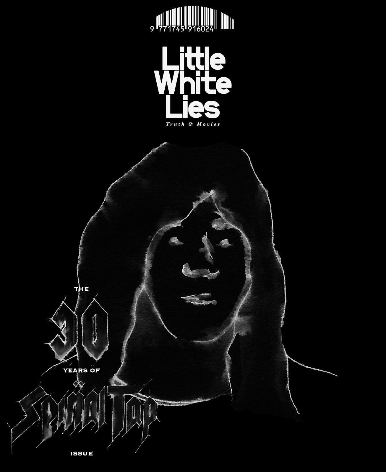
Below are my final outcomes that will get sent off to Little White Lies Magazine at the Church of London Creative Agency.


I am very pleased with these outcomes, the chalk effect is especially good in giving a texture that is unique.

Life Drawing And Further Developement


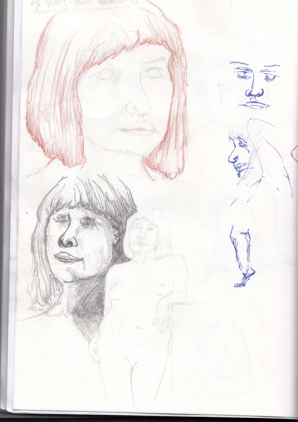
With the knowledge that i am drawing human faces and bodies i thought that it'd be best if i attended Life Drawing classes to see where i could improve on what i already had. Here is a scan of this double page spread from the session:


You may have noticed that i have drawn out both Nigel and David from the film on the right hand side of the page in a brown colour that i originally used to draw out a previous image of the band. This came about when i was complemented on how nice the blown up image of Derek looked and felt (below) after the statement that the Julian Opie style had been done to death.


I was then asked, why don't i do the other members in this style and blow them up to the same proportion and then just slot them into the template and invert the colours so as to give a chalk effect. So, here are my outcomes:


I am pleased with these outcomes, they look both realistic and strongly recognisable.
Now for the text in the same fashion:


I had to re-do Tap separately because i went wrong the first time.


And here are the numbers, as the title will still read 
'THE 30 YEARS OF SPINAL TAP ISSUE':


New Development


Once again i am left to develop my thoughts and current processes further. This time i am to take away the current idea but having made it larger to fill the blank space and trace around the image using thick marker pen to create simple, clean lines. This is a Julian Opie style of working:


Here is what my outcome would look like as, but cleaner and simpler of course that this image below used form my previous development post. This is just to get the correct image size so that i can slot it into my template and not worry this late in the game as to fiddling with sizes.


Below are the images that i have worked from both taken from my sketchbook and the internet:


Having had trouble with the likeness of this one above of David i had to resort to the photo below from the internet: 


Here are a selection of my tracing outcomes in marker pen:


The marker pen outcomes are strong an naive, but still not getting that likeness...

Moving forward, trying inks with water bleed:


Again, these are looking interesting and strong in terms of line quality, but unrecognisable...

Moving into the lettering for the cover in this style, i used a chisel tipped marker pen to get the lines straight and effective. Unfortunately this left the lines a bit to be desired in terms of neatness and legibility. So over all, i haven't moved too far from my previous development stage other than cleaner and simpler images to work with...


Unfortunately I have been notified by my lecturer that this style has been done to death and that i am to move on and progress in a different style... I am happy to do this as i am struggling with the likeness in this stye of work with my characters.


Wednesday, 23 January 2013

Further Ideas Development


Starting again with the lines Live Traced through Adobe Illustrator so as to be neater when compiled in Adobe Photoshop. Here are the outcomes:


I think that these outcomes above have potential and will be easier to manipulate in terms of inverting the colours, and because of the stronger lines, the images as a whole should appear more powerful.


The mast head is back to white again now and looks good here with this image, although overall it does come across a it pale and lost...


Below is the Live Traced text outcome. It does look messy here, but i also like how rough and ready it appears. Rock 'n' Roll.


The first mock up of a potential outcome. But this time, to fill the space i have enlarged the head. The lines are bold and powerful, which is good, although the text is a bit lost to me down there with all the white...


Silhouette With Text Development


Having developed the background further and causing it to become black, you get a feel for the images as a whole and how they would work/come across. I think that they are effective, but something still isn't quite there with them. I think that it's the 'negative' invert of the image, and although they do work well outlined white, i think i'll have to change the line texture. As well as this, i must change the Little White Lies mast head back to it's original white.

Here the text works as a negative, but i wonder what it would be like if it was filled in white...


Below is the text filled in white, which, in my opinion, works just as well, if not better. I will still need to refine the lines though and neaten it up.


These poses, especially Derek's (middle with mustache), remind me of the film, and how they come across as a 'want to be' band, and band that has made it, but garishly shows fashions flaws when it comes to doing what they think will get the best 'genuine' reaction, where as actually we're laughing at them, not with them.
These poses and the over all style also reminded me of the Grateful Dead album cover 'In The Dark'. Again, this whole thought process, for example, would occur to Spinal Tap of being fashionable because some one else has done it, but actually they're making fools of themselves.


Introducing Text


With not a lot of recognisable outcomes in terms of recognising who each member of the band is alone, straight away, i think that it'll be important to include the title of the film and mimic what Little White Lies does and put 'The... Issue', and seeing as this is the 30th anniversary edition, it will read 'The 30 Years Of Spinal Tap Issue'.

Below i have drawn out the Spinal Tap title in it's original style but kept the theme of the water and ink bleed to show continuity.
Here's the title in context for each cover (I naturally chose the bottom left hand corner for the text because otherwise it would take up too much of the image space and detract the eye):


I think that it works well from a distance, but i know that up close it becomes a very messy version, and although this works  because it relates t the theme of Spinal Tap and nothing quite coming out right, it doesn't come across professional and will need rendering/ revising/development.


Initial Idea Developed - silhouette


Moving forward from my initial outcome to work with, i wanted to keep with the clear theme of black. The Spinal Tap insert and case for the film is black, and the featured album in the film is black.
So, i have inverted all of the white space within the image to black along with the Little White Lies logo to be in-keeping and create a silhouette effect.


The feedback for this was constructively bad, and the reasons for being so were; that the Little White Lies mast head probably shouldn't be black - it should remain white; And that the images come across as poor quality negatives in my own eyes.

However, the use of black within the image has worked well, so i may take it further and produce, perhaps the background in black.